Standing on the Shoulders of our History
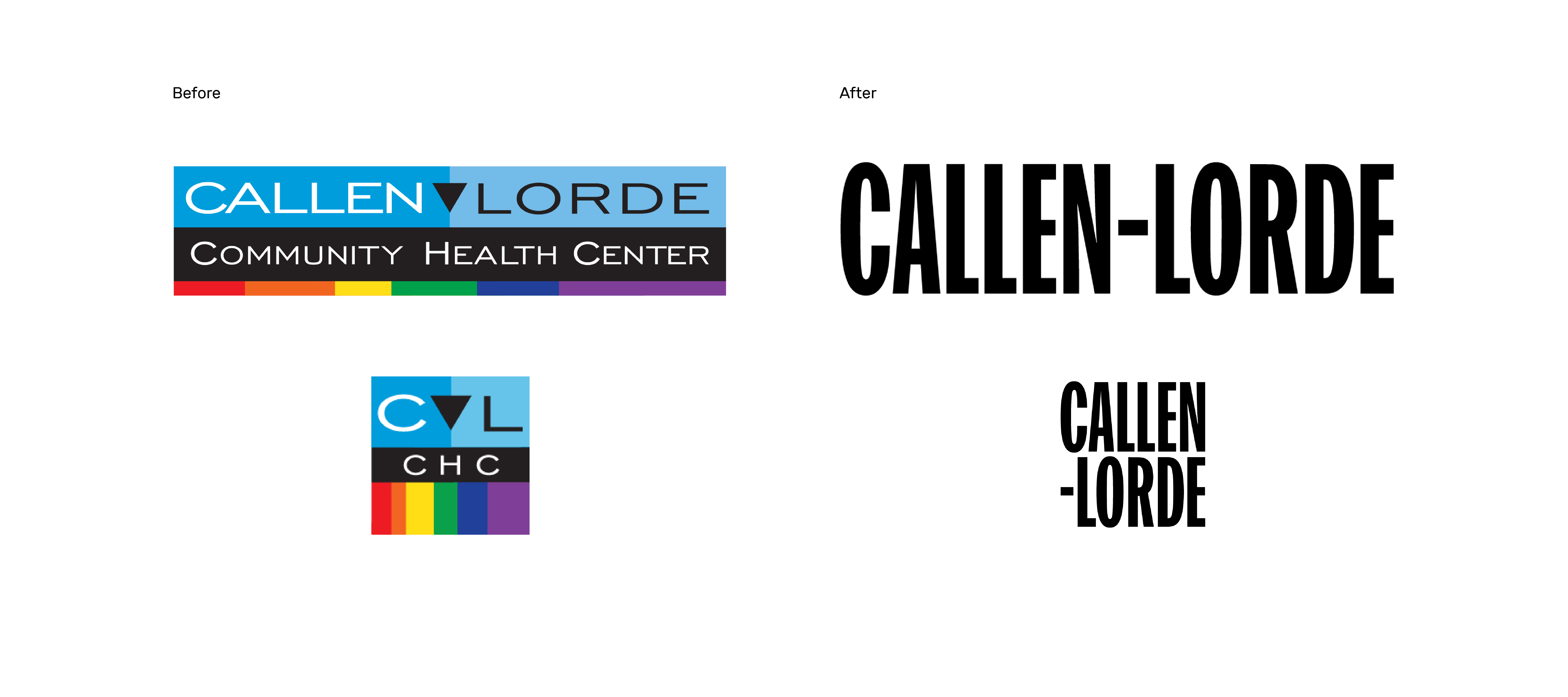
As we forge into the future with our new visual identity in partnership Mother Design, we stand on the shoulders of our rich history and pay homage to our former logo, created by then Associate Executive Director Richard Haymes in 1998.
Callen-Lorde’s grassroots heritage spanning nearly 50 years to the St. Mark’s Community Clinic and the Gay Men’s Health Project, two volunteer-based efforts that provided care to LGBTQ people, who were largely ostracized from mainstream healthcare settings. In 1983, these entities merged to form Community Health Project (CHP), a mostly volunteer-staffed episodic care program that housed the nation’s first community-based HIV primary care clinic.
Enter Richard Haymes, a graphic designer by trade who began volunteering with CHP in 1985 – first in the lab, then as coordinator of the evening sexual health clinic. By 1986, Richard was hired as Associate Executive Director and helped develop some of our cornerstone programs: a Women with HIV program, a predecessor to our Women’s Health Program; the Transgender Health & Education Program; and, the Health Outreach to Teens (HOTT) Program – all of which are still in existence today.
In 1998, CHP moved into our new headquarters – our current space at 356 West 18th St – and the newly named Callen-Lorde Community Health Center decided that it needed a more “corporate” look as we were entering our modern era as a licensed, sanctioned health care facility.
Richard designed the logo with this in mind, knowing that we would be competing with established health clinics and hospital medical centers vying for very little government funding. In short, we needed to fly under the radar to get on an equal playing field with mainstream health facilities. At the time, the triangle embedded in the logo was an LGBTQ nod that was not as recognizable to mainstream funders, and the rainbow stripe was not added until recently, in 2011, when LGBTQ issues started to gain wider acceptance.
Now, in 2017, we are harkening back to our roots with a new, bold, in-your-face design, created completely pro bono by Mother Design. The new color palate references the colors of the rainbow as well as the colors of the trans flag. It is flexible and can continue to change and evolve, as will the needs of those we serve.
Musing on the new logo created by Mother, Richard writes: “Design is always about subconsciously communicating a message or meaning to its target audience. I am so happy the new designers have taken nearly 50 years of variations of radical queer healthcare and opted to honor its roots. In 2017 it’s as it should be.”
We couldn’t agree more. Thank you to Richard, to Michael Callen, Audre Lorde and the many others who paved the way.

